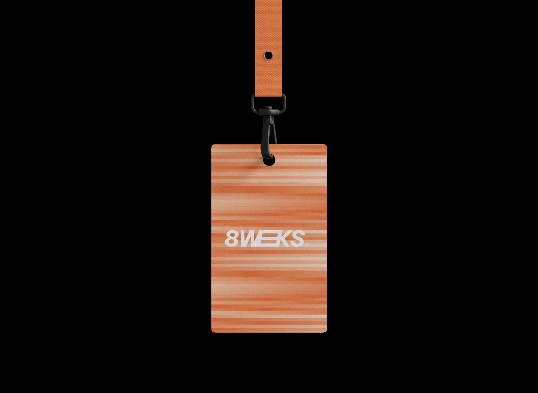
The 8weeks logo was designed to suggest movement and progress. The two E’s connect seamlessly with the W and K in a continuous line, creating a sense of flow and direction. Within this shape, a subtle abstract 8 also emerges.
The use of an italic typeface reinforces this dynamic feeling — the slanted letters express speed and urgency. The branding plays with two powerful gradients: orange to white (energy and warmth) and purple to white (balance and calm).
For the photography, we chose images that literally convey movement — blur, speed, and direction. Combined with a photoshoot featuring Eline and Jo, this creates a visual language that feels both professional and spontaneous.
The result? A branding and visual identity that perfectly capture the DNA of 8weeks: fast, focused, and always in motion.