© www.footyheadlines.com
From advertising to cultural artifact
The evolution of the soccer jersey reads like a concise history of graphic design. In the 1970s and 1980s, the jersey took on an increasingly commercial role. With the arrival of jersey sponsors, it turned into a walking billboard. In the 1990s, a new dimension was added. Manufacturers moved away from simple designs and experimented with bold colors, graphic patterns, and distinctive shapes. This resulted in jerseys that far exceeded their original function.
Think of the Netherlands’ orange outfit at the 1988 European Championship, or Arsenal’s yellow-and-black “bruised banana” shirt from the early 1990s. Designs that may have felt daring or even strange at the time, but today rank among the most sought-after soccer jerseys.
Even decades later, they still pop up in the stands—not as nostalgic costumes, but as cultural symbols. They have become statement shirts.
The World Cup as the ultimate branding moment
Once every four years, every country gets the chance to showcase itself on the world’s biggest stage. Not only through the team’s performance, but also through the way it presents itself.
A World Cup jersey must therefore do more than just look good. It must make a country recognizable. It must stand out among dozens of other uniforms, yet at the same time feel familiar to the people it represents.
Nigeria succeeded exceptionally well in this regard in 2018. The jersey became a global phenomenon and almost immediately grew into a design icon.
If you line up the most beloved World Cup jerseys side by side, you’ll notice how often older designs dominate the rankings. Nigeria is one of the few recent examples that has managed to take its place among those classics.
That’s the position every brand dreams of: being relevant in the moment, but not remaining tied to that moment. Becoming iconic is therefore not just a matter of budget or visibility. It starts with an idea that makes sense at its core.
Norway doesn't choose color, but typography
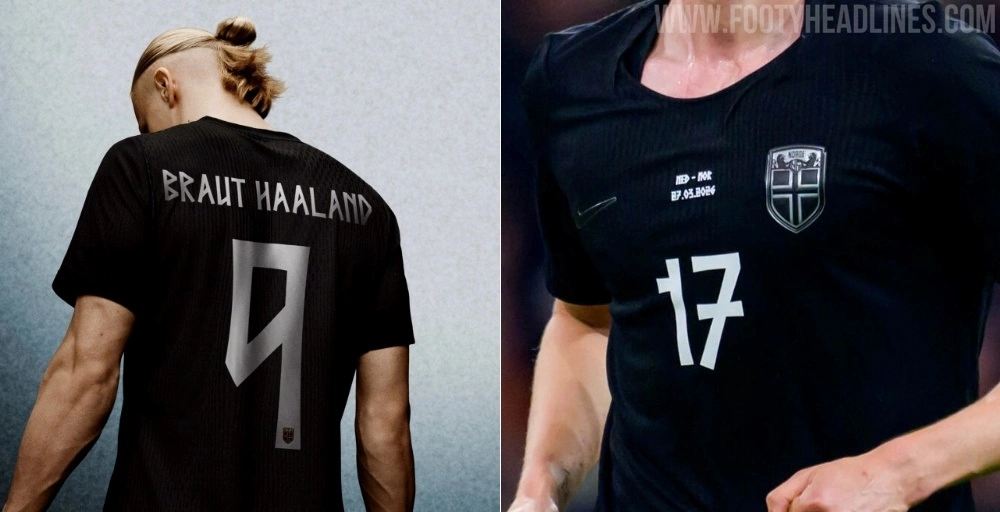
When Norway qualified for a World Cup after a long absence, the country chose a jersey that draws inspiration from its own culture and history.
The most striking feature is the typeface. Typography is one of the most powerful—yet also most underrated—carriers of identity. Letters give a brand a voice even before a single word is read.
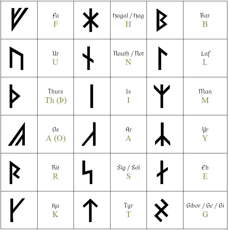
For Norway, a typeface was developed inspired by traditional Norwegian runes and the Elder Futhark. The design language consists of sharp angles, straight lines, and geometric structures. An ancient script is thus not literally copied, but translated into a contemporary context.
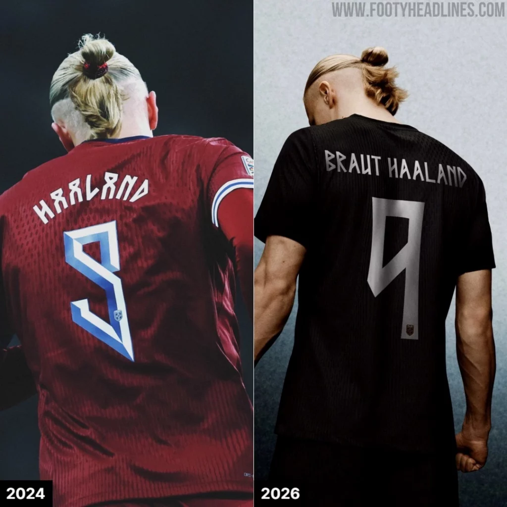
Curves give way to angles. Haaland’s number nine loses its familiar curve and takes on an almost architectural quality. Ødegaard’s number eight takes the shape of an hourglass.
The typography references the past without descending into folklore. It feels both historical and modern at the same time.
The real lesson can be found in what changed in Norway
Norway had previously experimented with a similar typographic style. That first version had plenty of character, but proved to be insufficiently legible and was rejected. The idea was strong, but the execution was not.
For the World Cup, the designers retained the essence and removed everything that interfered with its effectiveness. The shapes were simplified. Superfluous details were eliminated. The unique character remained recognizable, but the letters and numbers became clearer for referees, fans in the stadium, and television viewers.
This is not a compromise that weakens the design. It is exactly what good design is supposed to do.
A strong identity is both expressive and functional. Character without legibility results in a design that doesn’t work. Legibility without character results in a design that no one remembers.
The quality lies in the tension between those two.
That tension requires craftsmanship—testing, refining, and eliminating. It requires the patience to keep working when the idea is essentially sound but has not yet found its purest form.
First the direction, then the shape
At Studio Boiler, we believe that timeless brands are built on substance, not hype.
The Norwegian shirt shows why. It doesn’t stem from a visual trend, but from culture, history, and a clear starting point. The design isn’t just decoration added as an afterthought. It’s the logical result of a meaningful choice.
A strong brand, therefore, doesn’t start with the question of what it should look like.
It starts with the question of where it comes from, what it stands for, and what story it wants to continue telling.