For the logo, we looked for inspiration in the technical world Sitelogix operates in. We landed on TIN files, which are used in geographic information systems, civil engineering and 3D modelling to build terrains and surfaces from a network of triangles. Rather than adopting that principle literally, we reduced it to its essence: the triangle as a basic shape. From that simple geometry, we developed a clear and structured design in which the technical origins remain subtly present.
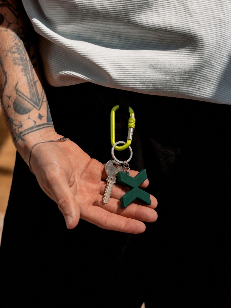
The X in Sitelogix became the anchor point of the new identity. We rebuilt it from two simple geometric shapes that meet exactly in the middle. The sharp angles and triangular planes give the element a sleek, modern and technical look. Thanks to its symmetrical construction, the shape stays beautifully balanced.
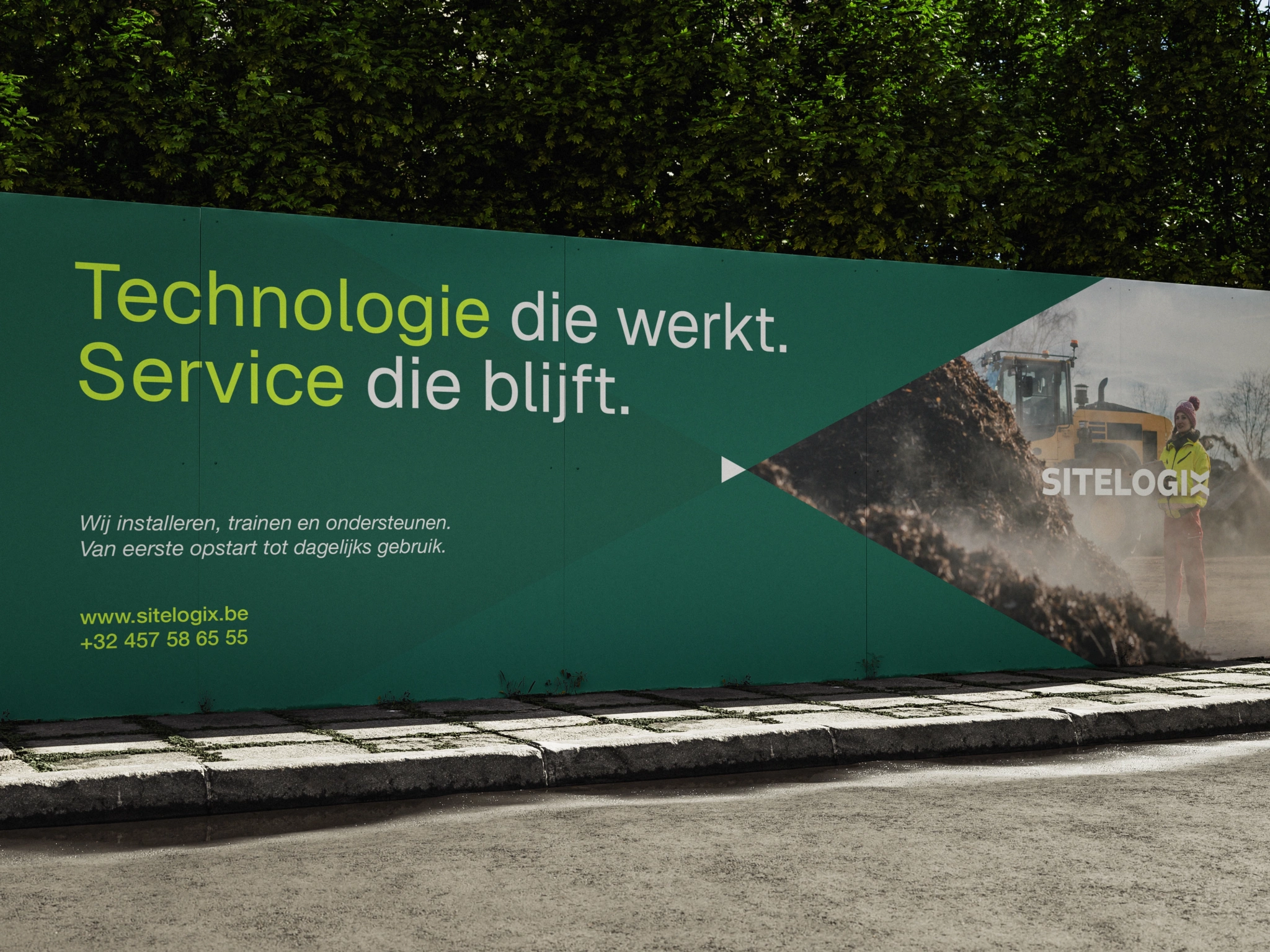
The X doesn't only work within the full wordmark. It can also be used on its own as a shortened logo, and at the same time forms the basis for the brand's graphic system. By taking the shapes apart, enlarging, cropping or recombining them, we created a flexible visual language that recurs recognisably across every application.
The website translates that same identity into a digital environment where technology takes centre stage, yet never feels complicated. Large typography, clear structures and strong product imagery help visitors quickly understand what Sitelogix does and where they need to go. The graphic shapes derived from the X return subtly throughout the interface, creating recognition without overpowering the content.
Just as Sitelogix makes complex technology accessible to people on the construction site, the website makes an extensive range easy to navigate.
A key part of this is the product module. The range is first divided into clear main categories, after which visitors can navigate further to the right solution or device. Every product page follows the same recognisable structure. A short introduction immediately makes clear what the product is for, followed by a closer look at its key features, benefits and applications. Those looking for more technical information will also find the specifications neatly grouped together.
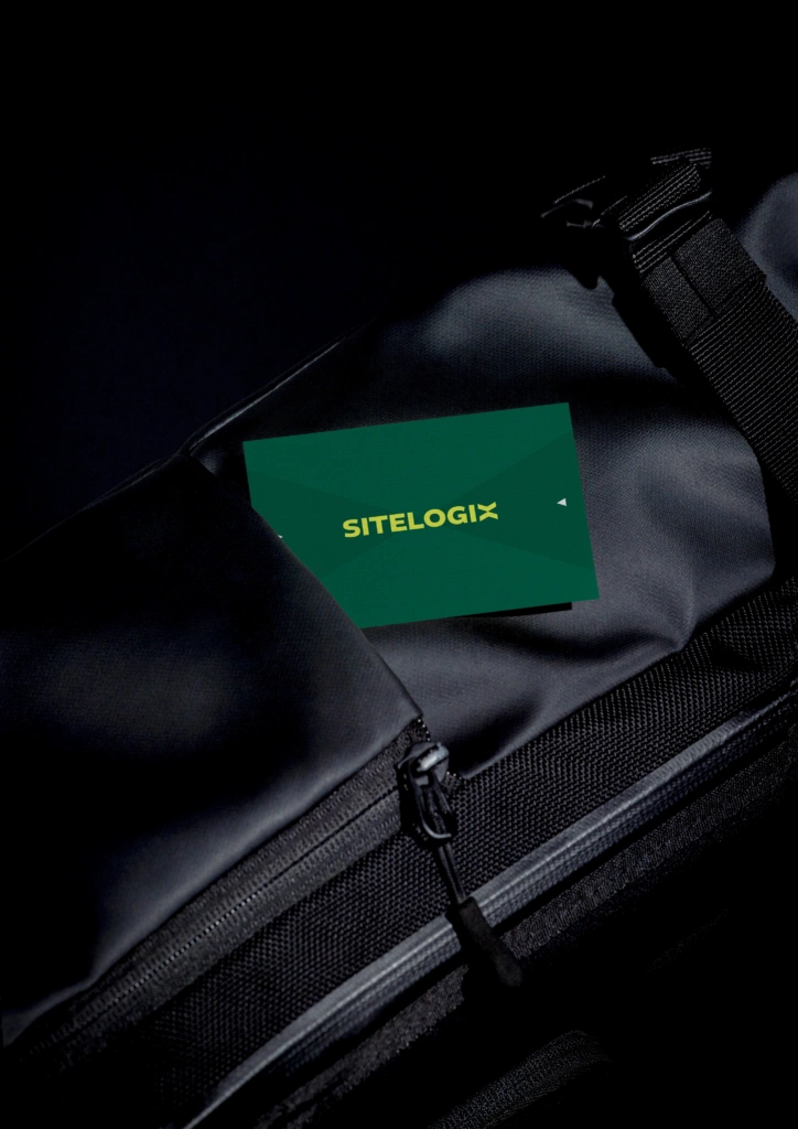
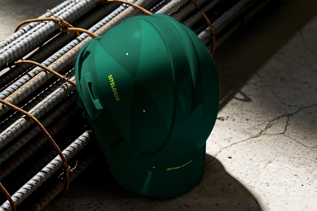
Deep Teal Green and Deep Emerald Green give the brand and website a reliable, technical and professional look. Against these, we set Bright Lime Green as a bold accent colour. This almost fluorescent green contrasts sharply with the darker shades, draws attention where it matters and adds extra recognisability, both digitally and in print.