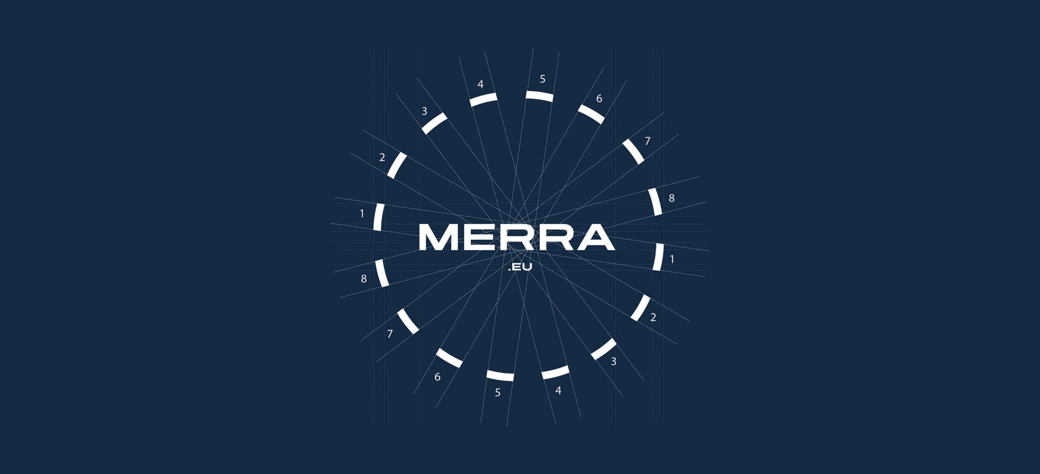
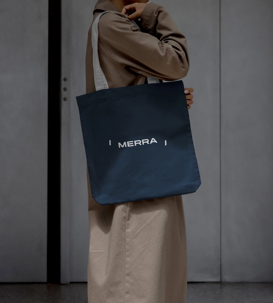
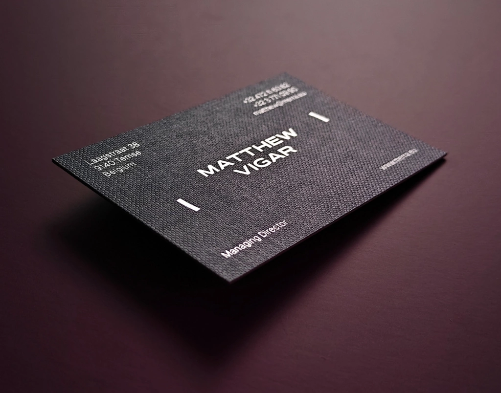
The logo plays with depth and dimension, inviting you to look at things just a little differently. Just as a mirror subtly interacts with its surroundings, so does the logo. It never reveals the full picture, only ever a fragment. That is exactly where its strength lies: when the perspective shifts, a new image emerges. The logo is therefore not a static symbol. It lives, responds and changes along with its surroundings. That same idea forms the foundation of the entire visual identity.
On the website, that sense of space is given full room. Large images, generous white space and calm typography let architecture, material and product speak for themselves. The site combines inspiration with a clear presentation of Merra's mirrors, lighting, partners and expertise, and is explicitly aimed at professionals and interior projects. As a result, the digital experience feels more like that of an interior or design brand than the typical website of a manufacturer, while the technical know-how and production capacity remain clearly visible.
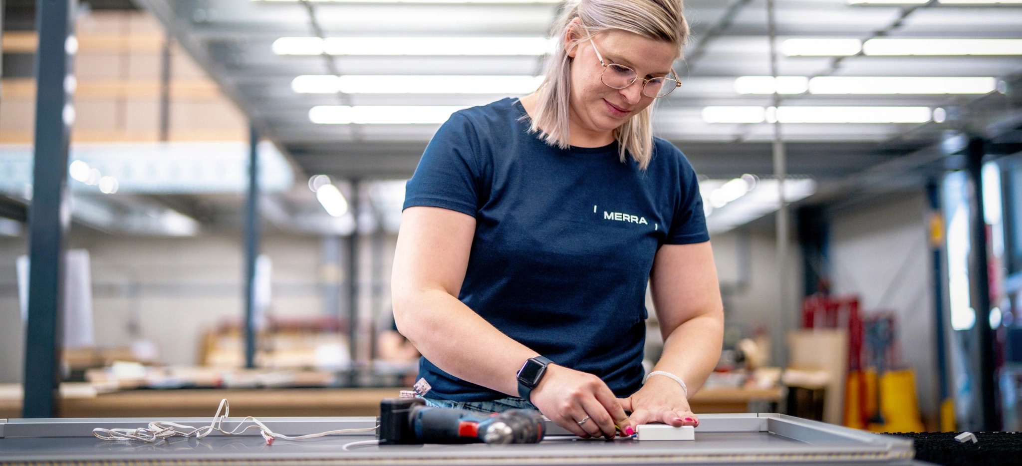
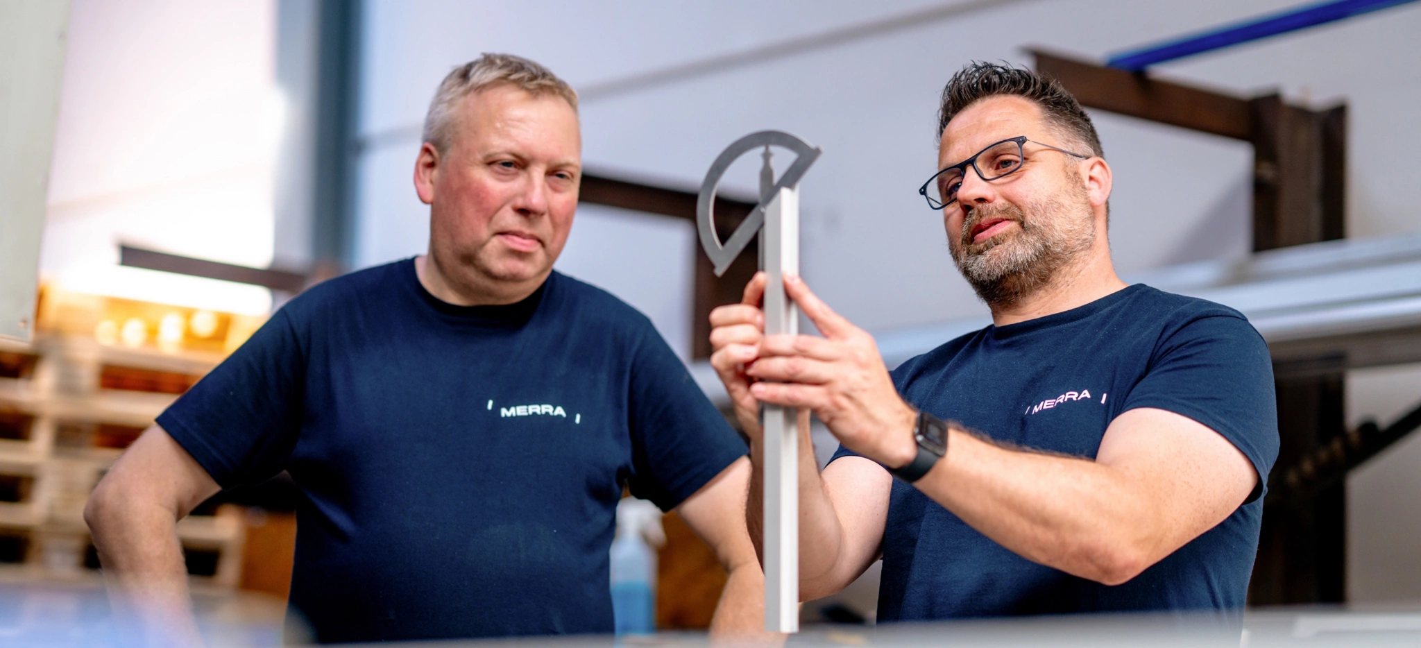
For the new photography, we deliberately chose not to show only perfectly finished mirrors. We also wanted to show who makes them. The camera follows the people as they work. No stiff corporate portraits, but real moments of concentration and craftsmanship. By playing with depth of field, reflections, glass and natural light, even the industrial production environment takes on a refined look. This gives the brand a human face and makes it clear that behind every finished product lie knowledge, precision and handcraft.
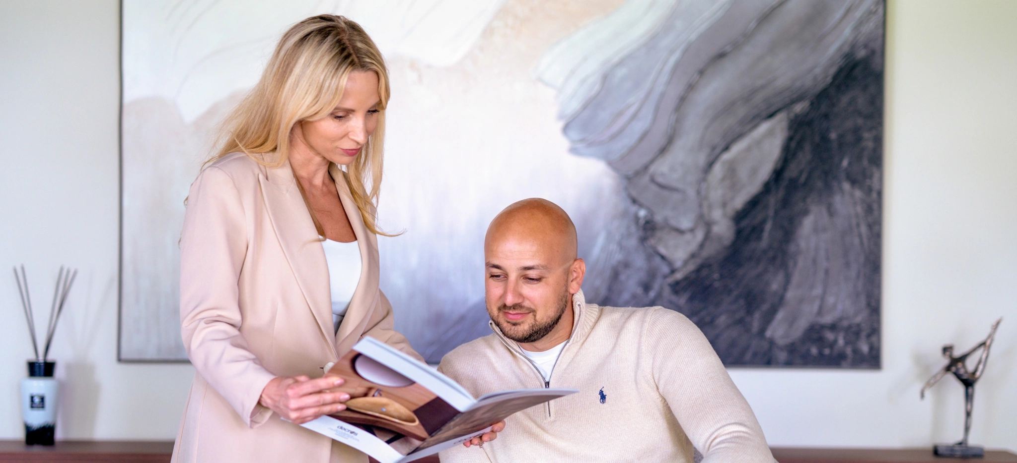
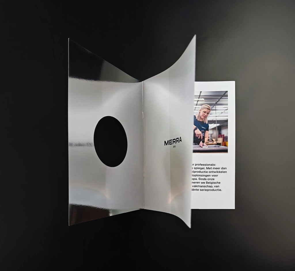
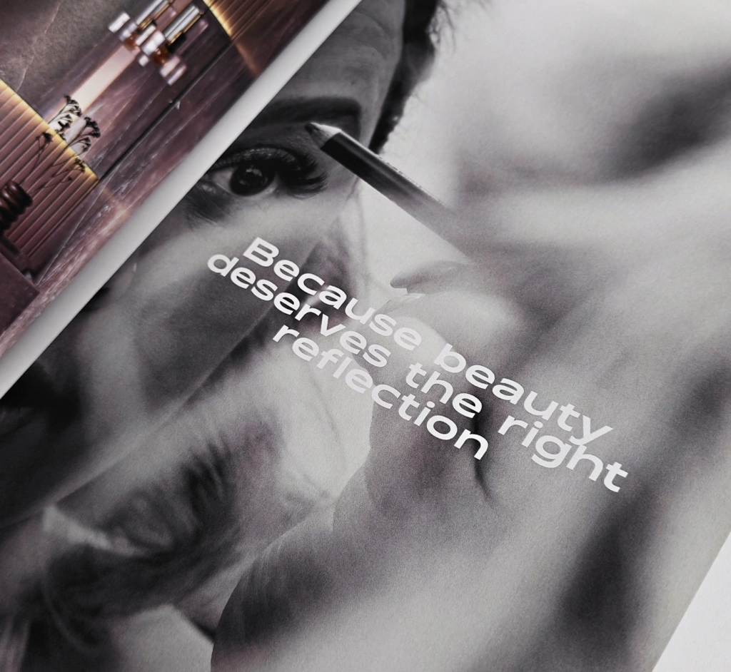
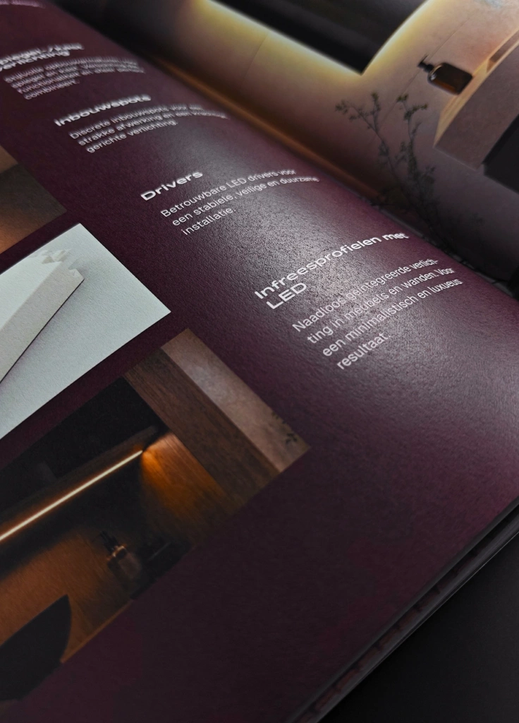
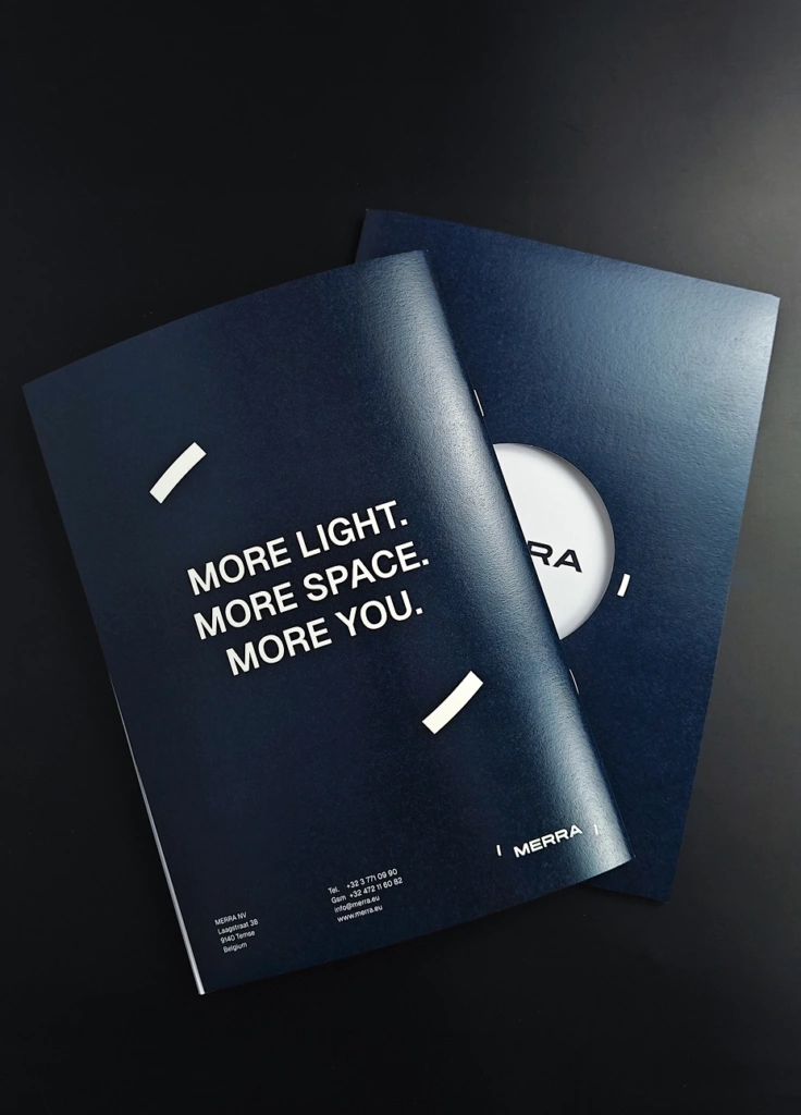
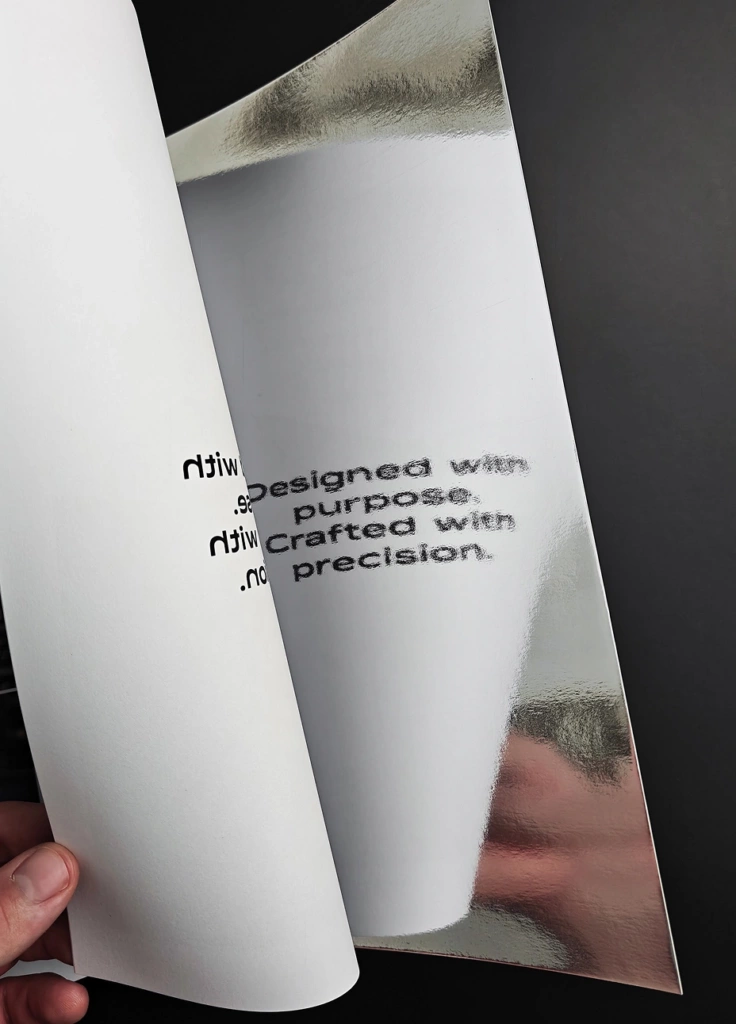
We also developed a brochure in which the concept becomes physically tangible. Cut-outs in the cover play with what remains visible and what stays hidden, while mirror paper literally adds a reflective element to the design. The brochure thus becomes more than a carrier of information: material, light and perspective become part of the experience.